- Building the Pages
4. Building the Pages
Part 4 of the From CV to Site tutorial series.
Prerequisites
- Completed Tutorial 3
- A design brief from Tutorial 2
What this tutorial produces
A working Next.js project with the standard academic site pages, running locally at http://localhost:3000. Deployment is covered in Tutorial 6.
Two paths through this tutorial
You can follow this tutorial in one of two ways:
Option A: fork the starter. Copy the starter/ directory from this repository as your starting point. All the scaffolding below is already done; you only need to replace the placeholder content. This is the fastest path and the recommended one if this is your first Next.js project.
git clone https://github.com/HakeoungLee/from-cv-to-site.git
cp -r from-cv-to-site/starter ~/dev/my-site
cd ~/dev/my-site
pnpm install
pnpm dev
Option B: build from scratch. Use the step-by-step instructions below to understand each file. This option is mostly instructive; Tutorials 5 through 7 assume the starter’s structure and scripts, so from-scratch builders should still use the starter as the reference for parser scripts, data types, and file paths.
The rest of this tutorial walks through Option B. If you chose Option A, skim to verify the project layout matches and then move to Tutorial 5.
Site structure overview
The following page structure is recommended for a lab or personal academic site. Omit pages that do not apply.
| Route | Purpose |
|---|---|
/ |
Home: identity, short intro, current focus |
/research |
Research themes and publications |
/projects |
Ongoing and past projects |
/teaching |
Courses and teaching materials |
/people |
Lab members (labs only) |
/news |
Recent announcements and updates |
/contact |
Contact information and affiliations |
Creating the Next.js project
Create the project from a clean terminal in a folder where you keep code (for example, ~/dev).
cd ~/dev
pnpm create next-app@latest my-site --typescript --tailwind --eslint --app --src-dir --import-alias "@/*"
cd my-site
Answer Yes to TypeScript, Tailwind CSS, ESLint, App Router, and the src/ directory when prompted. These defaults match the rest of the series.
Start the development server to verify installation:
pnpm dev
Open http://localhost:3000. You should see the Next.js starter page. Stop the server with Ctrl+C.
File organization
The project uses the Next.js App Router. Key directories:
my-site/
├── src/
│   ├── app/
│   │   ├── layout.tsx        # root layout: header, footer, fonts
│   │   ├── page.tsx          # home page
│   │   ├── research/
│   │   │   └── page.tsx
│   │   ├── projects/
│   │   │   └── page.tsx
│   │   ├── teaching/
│   │   │   └── page.tsx
│   │   ├── people/
│   │   │   └── page.tsx
│   │   ├── news/
│   │   │   └── page.tsx
│   │   └── contact/
│   │       └── page.tsx
│   ├── components/           # reusable UI components
│   ├── data/                 # generated data files (Tutorial 5)
│   └── lib/                  # utilities
├── public/                   # static assets (images, PDFs)
├── tailwind.config.ts
└── next.config.ts
Create the page folders now:
cd src/app
mkdir research projects teaching people news contact
Creating pages with Claude Code
Start Claude Code from the project root. Paste your design brief from Tutorial 2 at the start of the session. Request one page at a time.
Example request for the home page:
Create
src/app/page.tsxas the home page. It should use the fonts and colors defined in the design brief above. Include: a short headline, a two-sentence introduction, and a “current focus” section. Use semantic HTML and Tailwind utility classes. No client-side JavaScript unless required.
Review the generated file before accepting. Adjust copy and Tailwind classes as needed. Repeat for each route.
Building the home page
A minimal home page skeleton:
// src/app/page.tsx
export default function Home() {
  return (
    <main className="mx-auto max-w-3xl px-6 py-16">
      <h1 className="text-4xl font-serif mb-4">
        Your Lab or Name
      </h1>
      <p className="text-lg text-neutral-700 mb-12">
        One or two sentences describing your research.
      </p>
      <section>
        <h2 className="text-sm uppercase tracking-wider text-neutral-500 mb-2">
          Currently
        </h2>
        <p className="text-base">
          What you are working on right now.
        </p>
      </section>
    </main>
  );
}
Replace placeholder text with your own content.
Building the research page
The research page typically contains research themes and a publications list. Publications are generated in Tutorial 5; use a placeholder array for now.
// src/app/research/page.tsx
export default function Research() {
  return (
    <main className="mx-auto max-w-3xl px-6 py-16">
      <h1 className="text-3xl font-serif mb-8">Research</h1>
      <section className="mb-12">
        <h2 className="text-xl font-serif mb-4">Themes</h2>
        <ul className="space-y-3 text-neutral-700">
          <li><strong>Theme 1.</strong> Short description.</li>
          <li><strong>Theme 2.</strong> Short description.</li>
        </ul>
      </section>
      <section>
        <h2 className="text-xl font-serif mb-4">Publications</h2>
        <p className="text-neutral-500">Generated in Tutorial 5.</p>
      </section>
    </main>
  );
}
Adding the remaining pages
Use the same pattern for projects, teaching, people, news, and contact. Each page file exports a default React component that returns the page’s content.
For the contact page, include your institutional email, office location, and links to external profiles (Google Scholar, ORCID, etc.).
Root layout
The root layout at src/app/layout.tsx defines the header, footer, and fonts that appear on every page.
// src/app/layout.tsx
import type { Metadata } from "next";
import "./globals.css";
import Header from "@/components/Header";
import Footer from "@/components/Footer";

export const metadata: Metadata = {
  title: "Your Name",
  description: "Your Lab or research description",
};

export default function RootLayout({
  children,
}: {
  children: React.ReactNode;
}) {
  return (
    <html lang="en">
      <body className="antialiased">
        <Header />
        {children}
        <Footer />
      </body>
    </html>
  );
}
Create Header and Footer components in src/components/.
Navigation
A minimal header with site navigation:
// src/components/Header.tsx
import Link from "next/link";

const NAV = [
  { href: "/research", label: "Research" },
  { href: "/projects", label: "Projects" },
  { href: "/people", label: "People" },
  { href: "/teaching", label: "Teaching" },
  { href: "/news", label: "News" },
  { href: "/contact", label: "Contact" },
];

export default function Header() {
  return (
    <header className="border-b border-neutral-200">
      <nav className="mx-auto max-w-3xl px-6 py-5 flex flex-col sm:flex-row sm:items-center sm:justify-between gap-3">
        <Link href="/" className="prose-serif text-lg font-semibold">Your Name</Link>
        <ul className="flex flex-wrap gap-x-5 gap-y-1 text-sm">
          {NAV.map((item) => (
            <li key={item.href}>
              <Link href={item.href}>{item.label}</Link>
            </li>
          ))}
        </ul>
      </nav>
    </header>
  );
}
The flex flex-col sm:flex-row pattern stacks navigation items vertically on narrow screens and shifts to a horizontal row at the sm breakpoint (640 pixels). Remove /people from NAV if the site is for a solo researcher.
Footer
// src/components/Footer.tsx
export default function Footer() {
  return (
    <footer className="border-t border-neutral-200 mt-16">
      <div className="mx-auto max-w-3xl px-6 py-8 text-sm text-neutral-500">
        <p>Your Name, Your Institution.</p>
      </div>
    </footer>
  );
}
Typography setup
Next.js provides built-in font loading via next/font. Configure in the root layout:
import { Inter, Source_Serif_4 } from "next/font/google";

const sans = Inter({ subsets: ["latin"], variable: "--font-sans" });
const serif = Source_Serif_4({ subsets: ["latin"], variable: "--font-serif" });

export default function RootLayout({ children }: { children: React.ReactNode }) {
  return (
    <html lang="en" className={`${sans.variable} ${serif.variable}`}>
      <body>{children}</body>
    </html>
  );
}
Reference var(--font-serif) and var(--font-sans) in your Tailwind configuration or inline classes.
Swapping fonts
To use different fonts, replace the imports from next/font/google. Any font available on Google Fonts works:
// Editorial, serif-led combination
import { Lora, Work_Sans } from "next/font/google";

// Mono-led combination
import { JetBrains_Mono, IBM_Plex_Sans } from "next/font/google";
Update the variable names and className on <html> accordingly, and revise the CSS variables in src/app/globals.css to match.
Adding images
Images belong in public/. Next.js serves anything there at the site root.
public/
├── figures/
│   └── model-diagram.png
├── people/
│   ├── you.jpg
│   └── student.jpg
└── favicon.ico
Use the Image component from next/image for photos and figures above the fold. It handles responsive sizing, lazy loading, and modern formats (WebP, AVIF) automatically:
import Image from "next/image";

<Image
  src="/figures/model-diagram.png"
  alt="Diagram of the proposed model"
  width={800}
  height={600}
  className="rounded-md"
/>
For small decorative images or icons where those optimizations are unnecessary, a plain <img> is acceptable. Compress images before committing them with Squoosh or sharp; aim for under 200 KB per image.
Responsive considerations
The examples use max-w-3xl to constrain line length for readability. Tailwind’s default breakpoints (sm, md, lg) are sufficient for most academic sites. Test at three widths:
- Mobile: 375px (iPhone)
- Tablet: 768px (iPad portrait)
- Desktop: 1440px and above
Use Chrome DevTools’ device toolbar (Cmd+Option+I, then device icon) to verify each breakpoint.
Local preview
Run the dev server and navigate through each page:
pnpm dev
Visit http://localhost:3000, /research, /projects, /teaching, /people, /news, and /contact. Resolve any broken links or type errors before proceeding.
The starter renders as follows on first run (before replacing placeholder content):
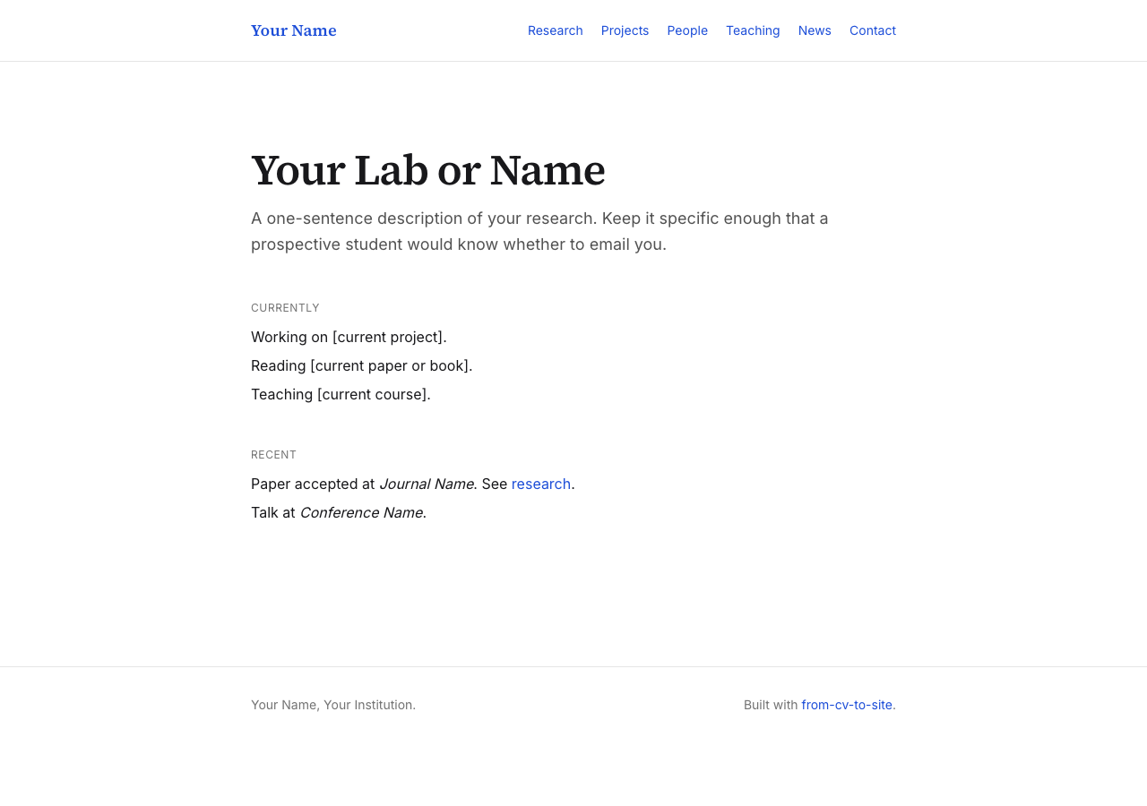
Research and projects pages are populated from data generated in Tutorial 5:

Committing progress
Initialize a Git repository and commit your progress:
git add .
git commit -m "Scaffold pages and layout"
Next tutorial
Questions or feedback: open an issue on the repository or email hannahlee@virginia.edu.